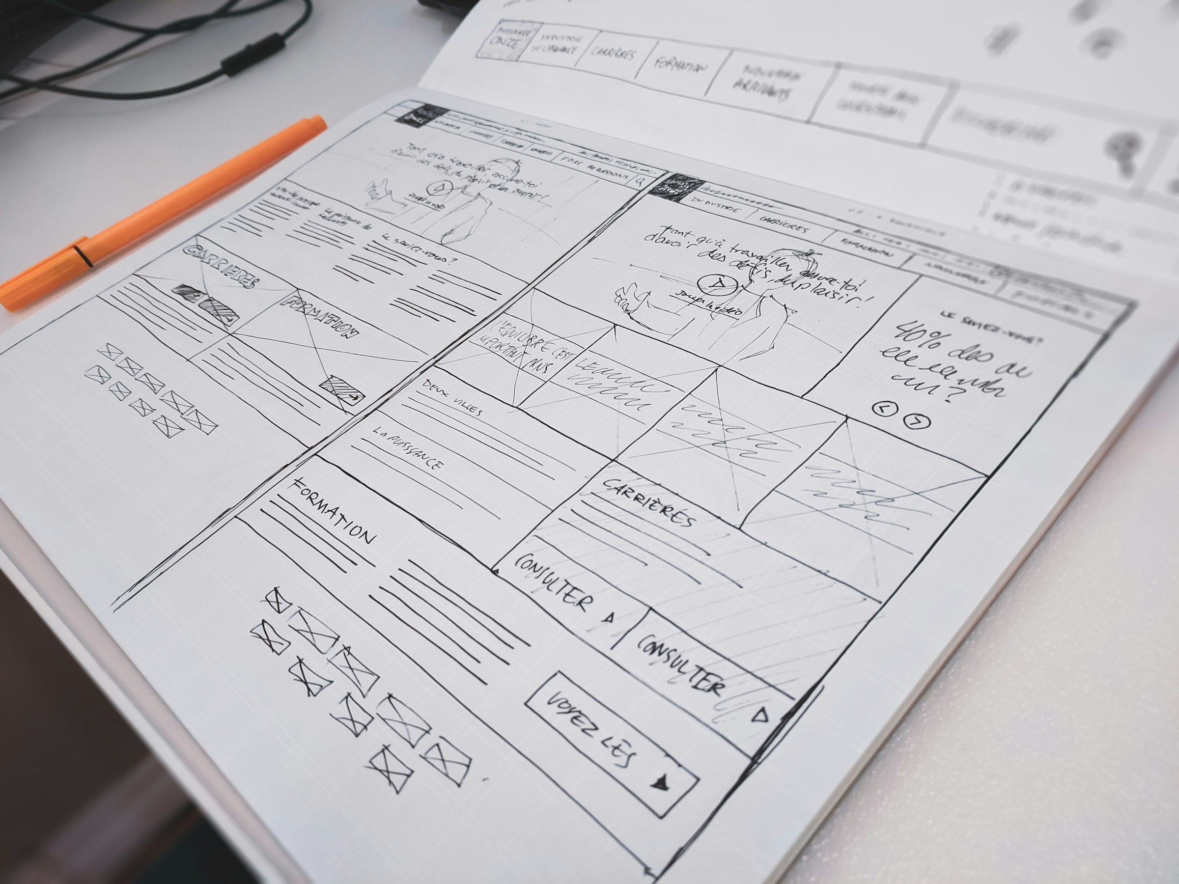
Short version: AI will put a page together for you in an evening, but by default it puts together the same page it gives everyone else. The difference comes from references, your own material and explicit bans - not from the length of your prompt.
Why every AI landing page looks the same
Everything the model produces looks fine at first glance. Tidy, modern, expensive even. The problem shows up later: by your third AI-built landing page you start seeing it - they're all the same. Same tricks, same blocks, same composition.
These are the tells that make a page read as "generated":
::before and ::after. They take a second to add and mean absolutely nothing.On its own none of these is a crime. A grid can be right, a glow sometimes holds a composition together. But as a set they make the page read instantly as "thrown together in an evening without thinking". That makes the site look cheaper and gives visitors less reason to trust it - people have seen enough of these to spot the template in half a second.
And the real damage isn't aesthetic. The template takes up the space where the product should be. Three cards and a pair of glows sit exactly where a visitor expects a screen of the interface, a number or a short demo.
Same family, in words:
- A headline like "Unlock your team's potential" - it fits literally anyone.
- The "Fast / Secure / Scalable" trio without a single number.
- A "Trusted by" strip with logos you don't actually have.
- Testimonials with placeholder avatars signed "CEO, Startup".
- Emoji instead of icons and gradient text in the headline.
- An FAQ of four questions nobody has ever asked you.
References, references and more references
This is the only thing that genuinely pulls a landing page out of the template. Not "make it modern and beautiful" but "do it like this, in this place, for this reason". The model doesn't know your taste - it knows the average internet. Whatever you don't show and don't name, it fills in with that average.
Where I go for references:
- Pinterest - fast moodboards and general mood. Good for colour, type and density. Bad for whole pages: plenty of pretty pictures there don't survive in a browser.
- awwwards.com - composition, rhythm, big type. With a caveat: half the work there is art that sells nothing. Take the technique, not the whole layout.
- Land-book, Godly - closer to the job, these are real product landing pages. Watch how people show an interface and their evidence.
- Mobbin - patterns from real products. Useful when you need to show a flow rather than a promise.
- 21st.dev - ready-made blocks in React and Tailwind. Handy for pointing the model at one specific component: "this kind of header, this kind of pricing".
Take three to five pages and write down which decision you're taking from each. "I like it" is useless: the model can't tell whether you mean the type, the colour, the grid or the motion.
| Element | What to write down |
|---|---|
| Hero | What's clear within five seconds and where the product appears |
| Typography | Headline size, line length and text contrast |
| Composition | Section order, density and visual pauses |
| Trust | Which facts back up the promise |
And always add anti-references - what it must not do. "No grid background", "no glowing blobs", "no three identical cards", "no fake 'trusted by' strip". Direct bans work better than any description of what you want: they close off the model's most well-trodden paths.
How to feed references to the model
Give it the "I want it like this" context and a concrete example right away. A bare link or screenshot works badly: the model sees the picture but has no idea what you liked in it. Say it in words.
Weak prompt: "Build a modern landing page for a task tracker, here's a reference."
Working prompt: "Hero - rhythm like screenshot 1: a two-line headline on the left, a real screenshot of the board on the right. Typography like screenshot 2: large grotesque, line length up to 60 characters. One accent colour, blue; everything else black on white. No grid backgrounds, no glows, no three-card rows. Below the hero - a three-step flow, each step with a screenshot."
What's worth attaching:
- Three to five screenshots with a note on what you're taking from each.
- A list of bans - usually shorter and more useful than a list of wishes.
- Your own material: product screenshots, numbers, user quotes, documentation.
- Tokens: typeface, size scale, radii, spacing, one accent.
Then keep the loop short: build the hero, look at it in the browser, name one problem, ask for that one fix. Asking it to "make it better" is pointless - the model will just reshuffle the same blocks.
Skills, YouTube and the "$1000 website"
YouTube is full of videos along the lines of "how to build a $1000 website". Worth watching if you're completely outside the world of front-end and AI: they walk through the process properly, from structure to build. This one, for example.
But almost every such video talks about skills and forgets the main thing: a skill doesn't make the millionth template, it makes the thousandth. They're the same copies, just slightly more universal. The floor goes up; the difference doesn't appear.
What a skill actually gives you, and what it doesn't:
- Gives: a floor. No disasters with contrast, spacing or mobile layout.
- Gives: consistency. Blocks on one page will look related.
- Doesn't give: difference. Two people with the same skill and a similar prompt get the same site.
- Doesn't give: meaning. A skill doesn't know what your product is or why you beat the alternative.
So the conclusion is simple: a skill is the foundation, not the house. The difference is what you bring - your references, your material, your bans.
Figma, design tools or straight to code
I've tried Figma, the design modes inside the models themselves and the whole "mockup to code" pipeline. For landing pages I've dropped all of it: I go straight to code. The reason is simple - the mockup goes through two or three iterations in the browser anyway, and moving those fixes back into the mockup means doing the work twice.
In code you immediately see the real typography, real line breaks, the real mobile view and how a block behaves with long text. Half the "beautiful" mockup decisions fall apart exactly there.
But if the project is big - a product, not a single page - build a design system first. Colour tokens, type and spacing scales, component states, rules for buttons and forms. Otherwise a month later you've got five shades of grey, four corner radii and three different "Submit" buttons.
Icons and images: don't ask a text model for them
A pain of its own. Text models write SVG by hand, coordinate by coordinate, and the result is almost always "looks about right but isn't": wobbly curves, different stroke widths across neighbouring icons, different optical sizes, rounded corners on one and sharp on the next. At 200 pixels in a mockup it passes; at a real 20 it falls apart.
So I don't trust text models with icons at all. There are two sane routes.
- Take a ready-made set. Lucide, Phosphor, Tabler, Heroicons - free, consistent, built on one grid and one stroke width. One set for the whole site, no "I'll grab a couple from another one", and you're already tidier than ninety percent of AI landing pages.
- Hand generation to an image model. Recraft, for instance: it does vector styles and gives you SVG rather than a bitmap you'd be embarrassed to scale. For your own illustrations and hero art that's the right tool - where a text model computes coordinates, an image model actually draws.
What to check on any generated icon before it goes on the page:
- One grid across the set - usually 24×24, with every icon drawn inside it.
- The same stroke width. A mix of 1.5 and 2 pixels is visible even to an untrained eye.
- Whether it reads at 16-20 pixels, not just in the mockup.
- Clean SVG: no stray groups, masks or hard-coded
fillif you colour it throughcurrentColor. - Transparent background and equal padding inside the viewBox, or the icons will dance in a row.
Copy that doesn't sound like every other SaaS
The headline should say what the product is, who it's for and what gets easier. Phrases like "unlock your potential" or "transform the way you work" don't let anyone picture a result.
Before: "Manage next-generation tasks with artificial intelligence."
After: "One board for your team and AI agents. An agent takes a task through MCP, changes its status and posts the result next to the team's work."
The second one has objects and actions - you can verify it and you can show it on screen. There's a simple test: drop a competitor's name into your headline. If nothing breaks, the headline is empty.
After generating, cut the intros that repeat the headline, replace opinions with facts and read it out loud. If a sentence is hard to say, it's hard to read.
How to build: sections and passes
Most product pages need five meaningful steps:
- Promise. What the product is and who it helps.
- Proof. An interface, a demo or a measurable result.
- Flow. What the user does from start to outcome.
- Conditions. Features, limits, security, integrations, price.
- Next step. One primary call to action.
Don't turn every feature into its own card - that's exactly how you end up with a component catalogue instead of a page. Group the details around the user's jobs.
And don't hand the model the whole page in one prompt. A bad hero decision will then repeat itself through the copy, the design and the code. Work in short passes:
- Structure: section headings and one goal for each.
- Facts: button labels, evidence, answers to objections.
- References, visual rules and explicit bans.
- The hero - together with the nearest piece of proof, not on its own.
- Rolling the rules out to the remaining sections and states.
- Separately: mobile layout, keyboard, forms.
After every pass, ask the model to find repetition, generic phrases and elements without a job. That editorial request is often more useful than another design variation.
SEO and speed
How the page was built gives you no bonus and no penalty by itself. Google recommends people-first content: the page should answer one specific need in full instead of repeating a keyword in every block.
- One search intent per page - don't mix a homepage with a help article.
- A descriptive
title, one visibleh1, a useful meta description. - Links to docs, cases and articles that answer the next questions.
- Alt text on meaningful images, an empty
alton decorative ones. - Canonical, Open Graph, a preview image and no accidental
noindex.
Speed counts too. Core Web Vitals look at loading, responsiveness and visual stability through LCP, INP and CLS. Set image dimensions, don't lazy-load the hero image and avoid animation that shifts text. Those half-screen glows, by the way, are also extra work for the browser.
Sources: Google's helpful content guidance, SEO Starter Guide and Core Web Vitals.
What to check before publishing
- Within five seconds a visitor knows what the product is, who it's for and what to do next.
- The hero shows the product or the proof, not only a promise.
- Not a single tell from the first part: no grid, no glows, no row of three identical cards.
- Every section adds a new idea and each button names a concrete action.
- The mobile layout keeps the priorities and doesn't hide the main action.
- Forms have labels, the page works from the keyboard, contrast keeps text readable.
- Links work, test data is gone, metadata and analytics are configured.
Final check: open the page on a phone and hand it to someone from your audience. Don't ask "do you like the design", ask "what is this, who is it for and why try it". If they can retell it in their own words, the page works.
FAQ
Can you build a landing page with AI without a designer?
You can, if you have annotated references, real product material and time for a manual review. The model speeds up the build but doesn't make product decisions for you.
How do you tell a page was made by AI?
Grid background, blurred glows in the corners, three identical badge cards, the "fast / secure / scalable" trio, and a headline that would fit any competitor.
How many references do you need?
Three to five annotated ones beat thirty unannotated. The value is in the note - what exactly you're taking from each and what you're not.
Do ready-made skills and templates help?
They raise the floor but they don't create difference: same template, just more universal. The difference is what you bring - material, references and bans.
Where do you get icons?
From a ready-made set like Lucide or Phosphor, or from an image model - Recraft, for example, which does vector and returns SVG. Don't ask a text model to draw SVG: the stroke widths and the grid will drift almost every time.
Can an AI-built landing page rank in search?
Yes. What matters is a useful answer, clear structure, accessibility, correct metadata and page speed, not the tool that generated the code.
If you're still choosing what to build it all with, there's the comparison of Cursor, Codex and Claude Code.